Re-creating Plots from The Economist in R and ggplot2
2016-08-21
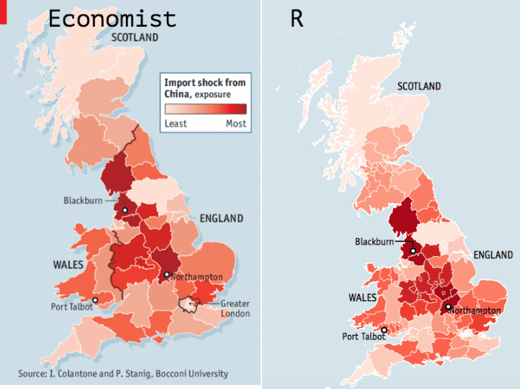
 The Economist is well known for its graphs and images, and I personally like them a lot. I was doing some work on Brexit when I spied the image above, and thought how much I would like to make something similar. Since my go-to environment is R, and its go-to plotting package
 ggplot2, I thought I'd try to recreate the image using these tools. (Hat tip: I was half-way through doing this, and getting a little irritated with British place names, when I came across this fantastic RPub, which helped a lot with the area names. The code below that deals with cleaning up and merging the administrative area data comes from Benjamin. (*Edit: this code chunk was hugh, so I think it's better to source it from GitHub gists. That's what the code below does now. The original is here)
The data that we start off with is available from the UK Electoral Commission.
library(devtools)
source_gist("d969a3681bccfc089a202478ff3c1306",
            filename = "brexit.R")
So, after all that data tidying, we're ready to make our plot. Since the Economist uses the ITC Officina Sans font, you'll need that on your computer (or something similar). With the extrafont package, we can take avail of these, well, extra fonts.
library(extrafont)
font_import()
# There are various folders on my mac with fonts in them:
font_import("/Users/robert/Library/Fonts/")
font_import("/System/Library/Fonts/")
font_import("/Library/Fonts/")
loadfonts()
# see what's available:
fonts()
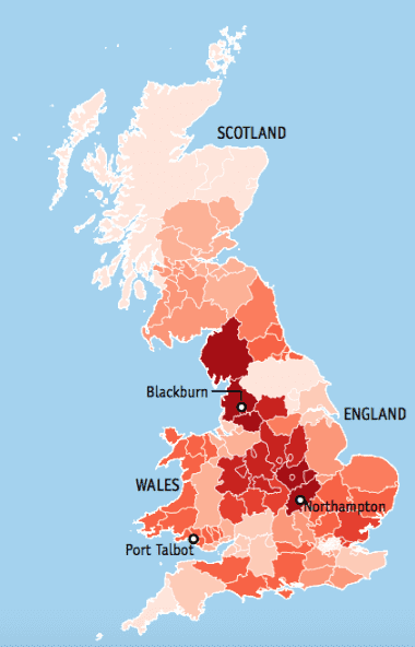
The following code makes the plot that I wanted, with the image saved and the font that I need embedded in the pdf that is produced. In Rstudio, no text will appear, as this font is not supported. But it'll be in the pdf.
MM <- ggplot() +
  geom_polygon(data = uk.plot1, aes(x = long, y = lat, group = group, fill = Import_shock), colour = "white", size = 0.1) +
  scale_fill_distiller(palette = "Reds", breaks = pretty_breaks(n = 8)) +
  geom_point(aes(x = cities.lon, y = cities.lat), color = "black", size = 2.5, shape = 21, fill = "black") +
  geom_point(aes(x = cities.lon, y = cities.lat), color = "white", size = 1, shape = 21, fill = "white") +
  theme_nothing(legend = T) +
  annotate("text", x=-4.75, y=52.5, label="WALES", size=4, family = "ITCOfficinaSans LT Book") +
  annotate("text", x=1.12, y=53.65, label="ENGLAND", size=4, family = "ITCOfficinaSans LT Book") +
  annotate("text", x=-2.2, y=57.9, label="SCOTLAND", size=4, family = "ITCOfficinaSans LT Book") +
  annotate("text", x=-4.7, y=51.42, label="Port Talbot", size=3.45, family = "ITCOfficinaSans LT Book") +
  annotate("text", x=.3, y=52.15, label="Northampton", size=3.45, family = "ITCOfficinaSans LT Book") +
  annotate("segment", x = -3.3, xend = -2.5, y = 54, yend = 54) +
  annotate("segment", x = -2.5, xend = -2.5, y = 54, yend = 53.85) +
  annotate("text", x=-4.22, y=54, label="Blackburn", size=3.45, family = "ITCOfficinaSans LT Book") +
  xlim(range(uk.plot1$long)) + ylim(range(uk.plot1$lat)) +
  theme(plot.background = element_rect(fill = "#A4D3EE", colour = "#A4D3EE"), panel.background = element_rect(fill = "#A4D3EE", colour = "#A4D3EE"), legend.position = "none") +
  coord_map()


ggsave("Brexit_test.pdf", MM)
embed_fonts("Brexit_test.pdf")
It's not exactly the same (I could not get that legend to work right!), but I think it's a pretty close match. Good, stuff, R 👏 .
P.s. I know there are themes available to get close to the Economist's image style, but I wanted do it myself 😃. Anyway, if you'd like to include the theme_economist() function from the ggthemes package, it's easy:
Eco <- ggplot() +
  geom_polygon(data = uk.plot1, aes(x = long, y = lat, group = group, fill = Import_shock), colour = "white", size = 0.1) +
  scale_fill_distiller(palette = "Reds", breaks = pretty_breaks(n = 8)) +
  geom_point(aes(x = cities.lon, y = cities.lat), color = "black", size = 2.5, shape = 21, fill = "black") +
  geom_point(aes(x = cities.lon, y = cities.lat), color = "white", size = 1, shape = 21, fill = "white") +
  theme_economist() +
  annotate("text", x=-4.75, y=52.5, label="WALES", size=4, family = "ITCOfficinaSans LT Book") +
  annotate("text", x=1.12, y=53.65, label="ENGLAND", size=4, family = "ITCOfficinaSans LT Book") +
  annotate("text", x=-2.2, y=57.9, label="SCOTLAND", size=4, family = "ITCOfficinaSans LT Book") +
  annotate("text", x=-4.7, y=51.42, label="Port Talbot", size=3.45, family = "ITCOfficinaSans LT Book") +
  annotate("text", x=.3, y=52.15, label="Northampton", size=3.45, family = "ITCOfficinaSans LT Book") +
  annotate("segment", x = -3.3, xend = -2.5, y = 54, yend = 54) +
  annotate("segment", x = -2.5, xend = -2.5, y = 54, yend = 53.85) +
  annotate("text", x=-4.22, y=54, label="Blackburn", size=3.45, family = "ITCOfficinaSans LT Book") +
  xlim(range(uk.plot1$long)) + ylim(range(uk.plot1$lat)) +
  theme(axis.ticks = element_blank(), axis.title = element_blank(), axis.text = element_blank(), panel.grid.major.y = element_blank(), legend.position = "none") +
  coord_map()

ggsave("Brexit_test_Econ.pdf", Eco)
embed_fonts("Brexit_test_Econ.pdf")
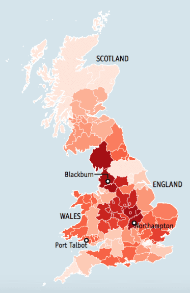
The combination is better, actually:
If we put them side by side, you can see that we didn't actually do a bad job:
There are (of course) also other great examples of using ggplot2 to recreate images, in this case textbook statistical distributions.


