What do the mtcars actually look like?
It popped into my head the other day that I had no idea what most of the cars in the mtcars dataset look like. Some Google image searches later, I had a folder of them (you can get them here – mtcars.zip, they’re all free to use as far as I could tell from the image search) and thought I’d try to shove them into tibbles and plots somehow.
Here’s the list of the images:
images/
├── AMCJavelin.jpg
├── CadillacFleetwood.jpg
├── CamaroZ28.jpg
├── ChryslerImperial.jpg
├── Datsun710.jpg
├── DodgeChallenger.jpg
├── Duster360.jpg
├── FerrariDino.jpg
├── Fiat128.jpg
├── FiatX1-9.jpg
├── FordPanteraL.jpg
├── HondaCivic.jpg
├── Hornet4Drive.jpg
├── HornetSportabout.jpg
├── LincolnContinental.jpg
├── LotusEuropa.jpg
├── MaseratiBora.jpg
├── MazdaRX4.jpg
├── MazdaRX4Wag.jpg
├── Merc230.jpg
├── Merc240D.jpg
├── Merc280.jpg
├── Merc280C.jpg
├── Merc450SE.jpg
├── Merc450SL.jpg
├── Merc450SLC.jpg
├── PontiacFirebird.jpg
├── Porsche914-2.jpg
├── ToyotaCorolla.jpg
├── ToyotaCorona.jpg
├── Valiant.jpg
└── Volvo142E.jpg
Ok, so let’s load some libraries and and see what they look like in a tibble:
library(tidyverse)
library(glue)
library(pander)
library(magick)
mt <- mtcars %>%
rownames_to_column("model") %>%
mutate(imgnames = glue("images/{str_remove_all(model, ' ')}.jpg")) %>%
rowwise() %>%
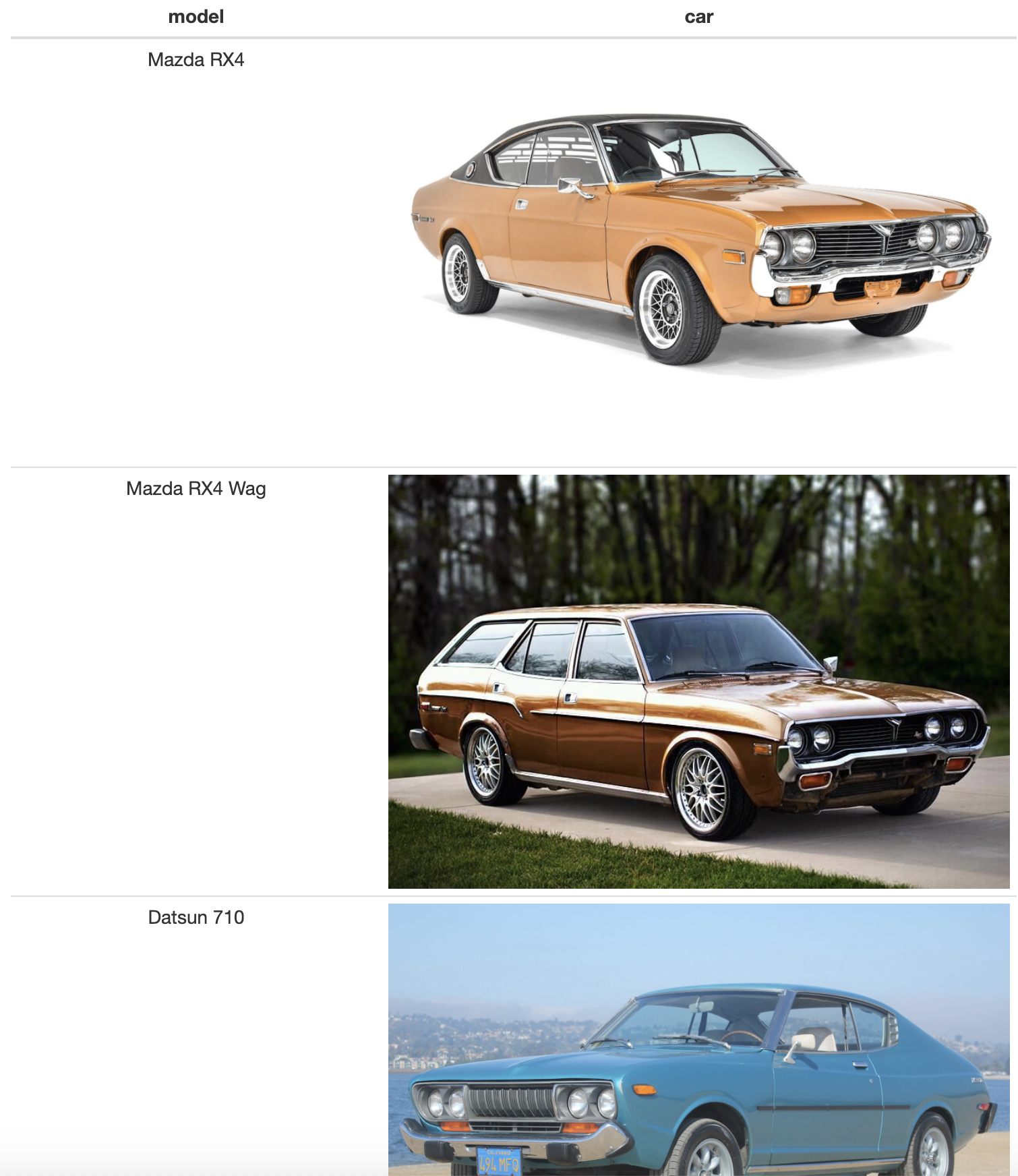
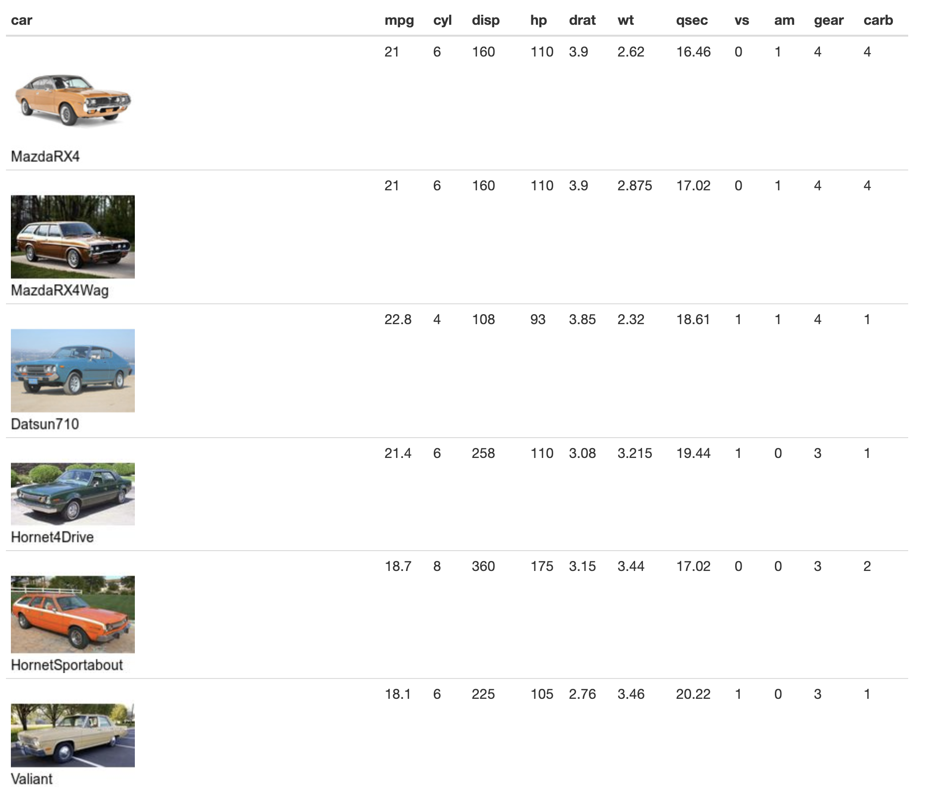
mutate(car = pandoc.image.return(imgnames))mt %>% select(model, car) %>% pander()| model | car |
|---|---|
| Mazda RX4 | 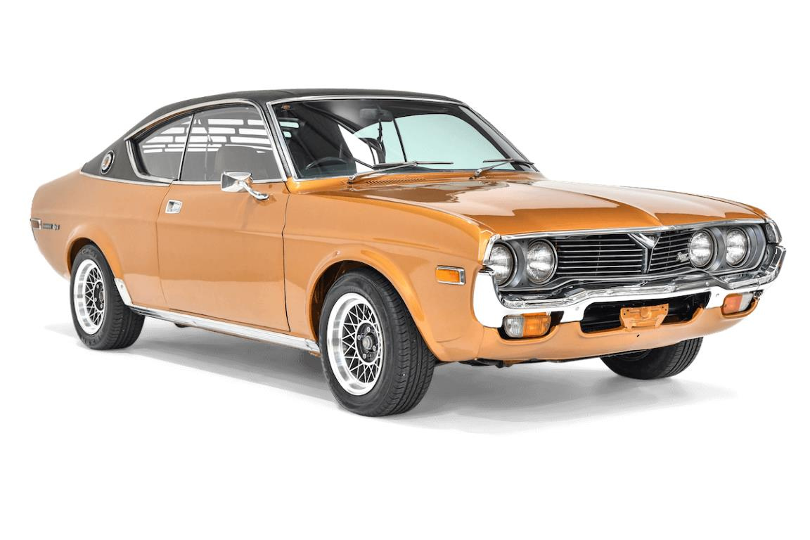 |
| Mazda RX4 Wag | 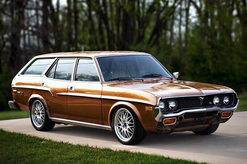 |
| Datsun 710 | 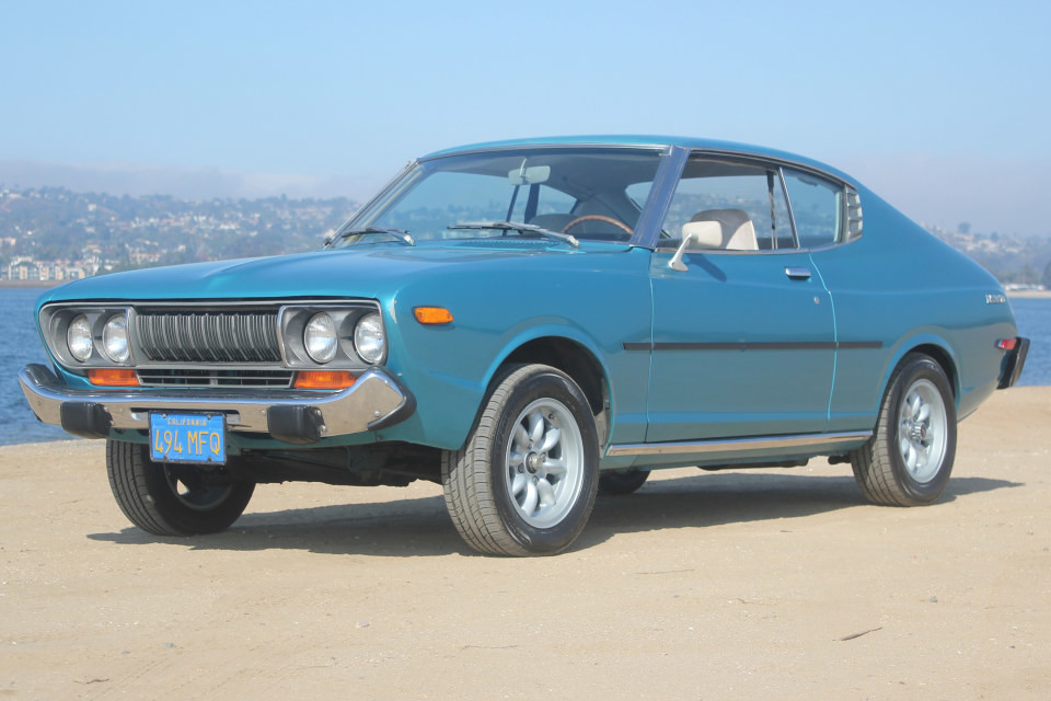 |
| Hornet 4 Drive | 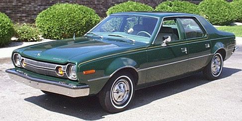 |
| Hornet Sportabout | 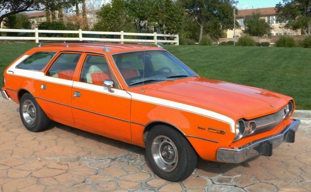 |
| Valiant | 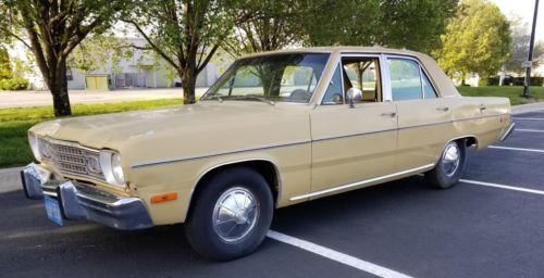 |
| Duster 360 | 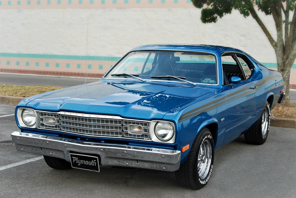 |
| Merc 240D | 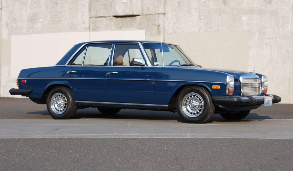 |
| Merc 230 | 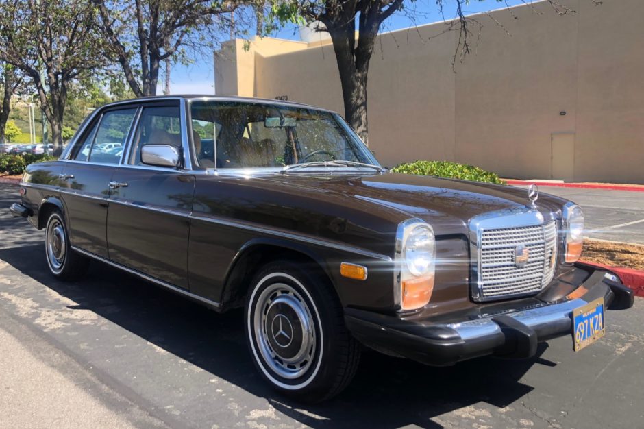 |
| Merc 280 | 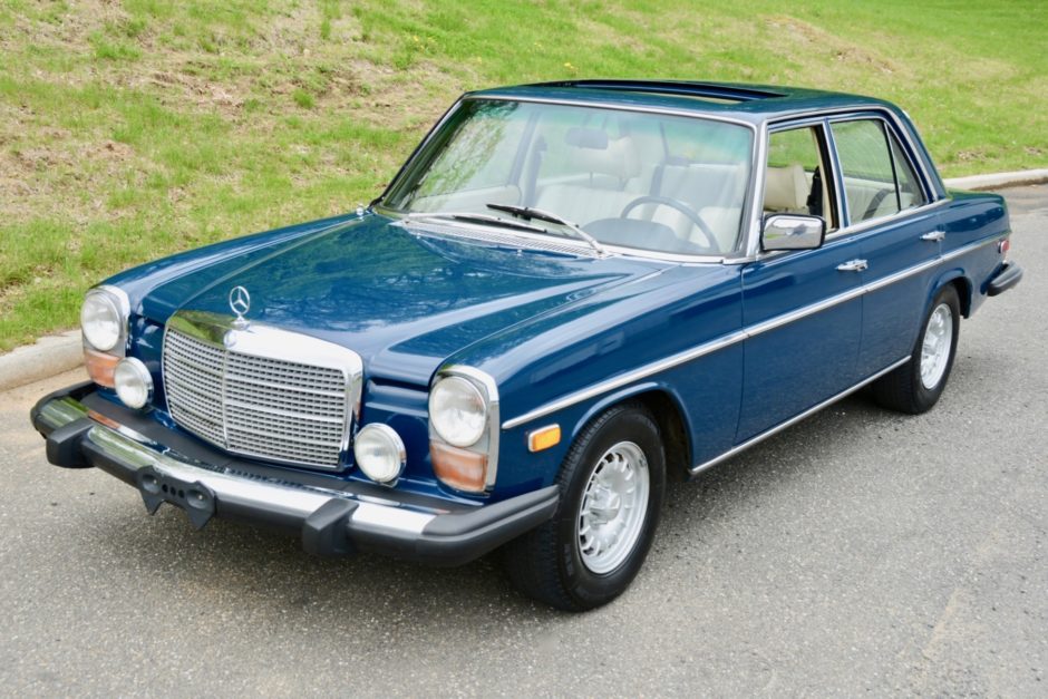 |
| Merc 280C | 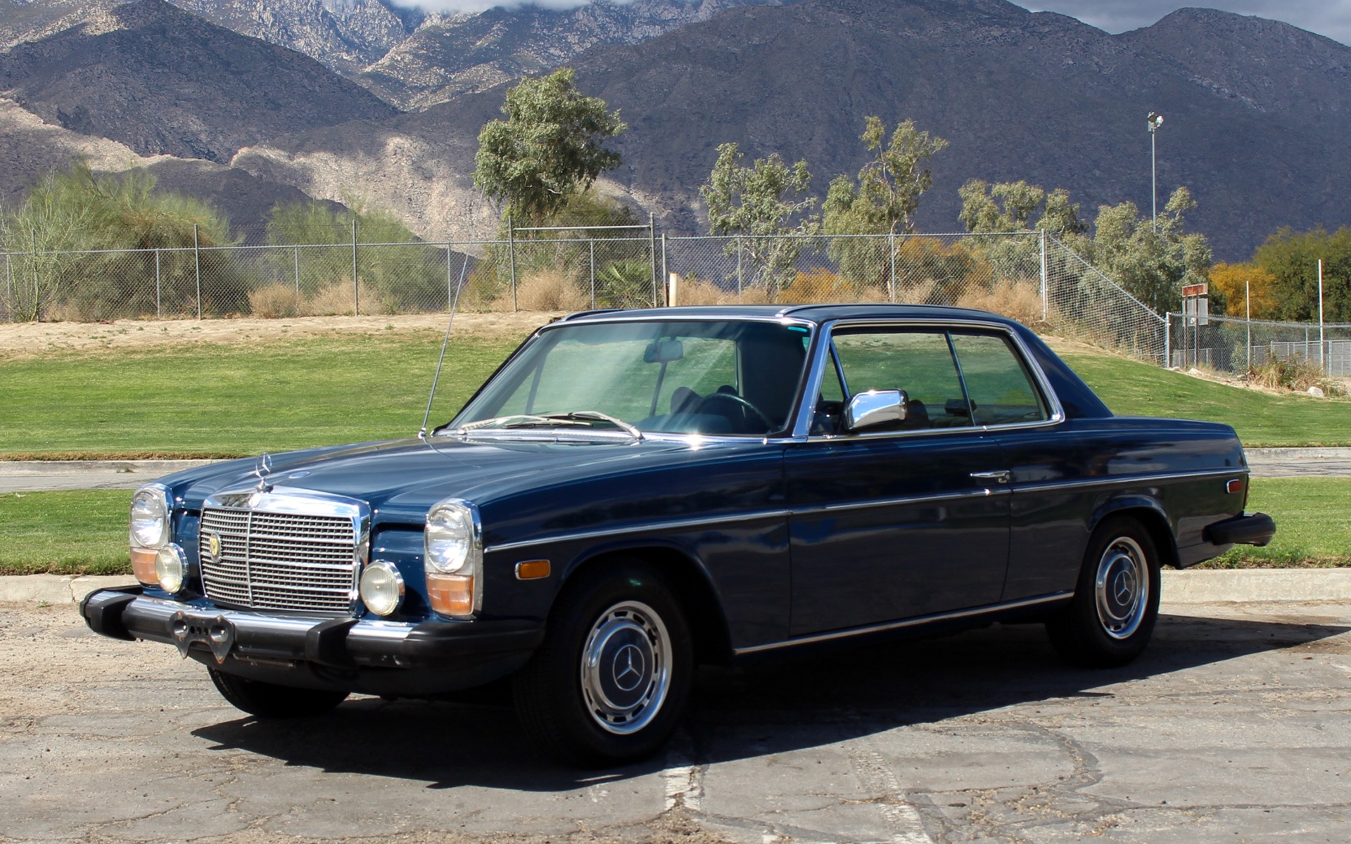 |
| Merc 450SE | 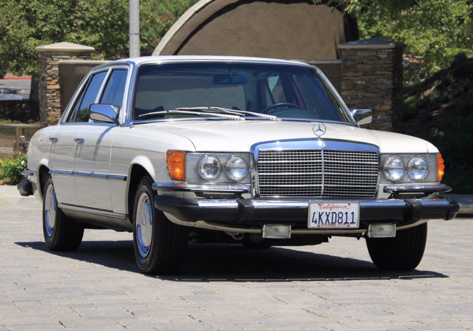 |
| Merc 450SL | 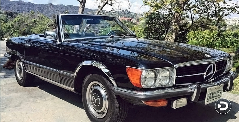 |
| Merc 450SLC | 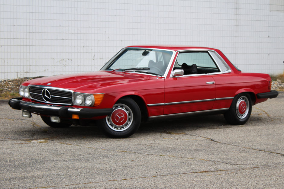 |
| Cadillac Fleetwood | 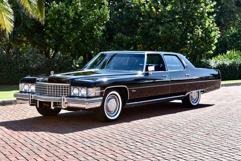 |
| Lincoln Continental | 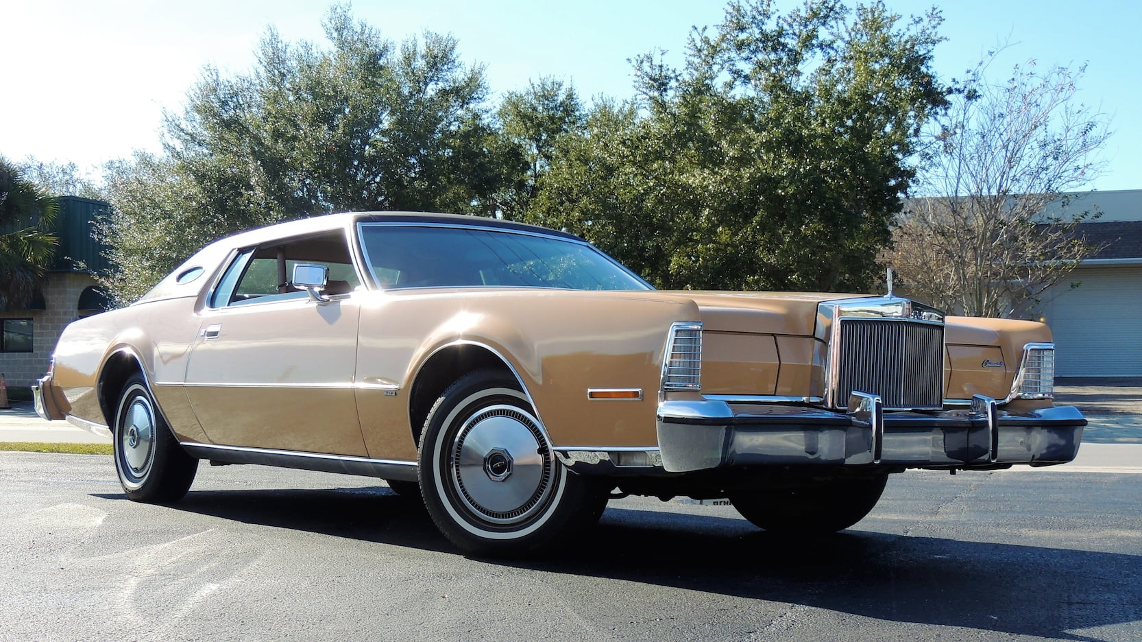 |
| Chrysler Imperial | 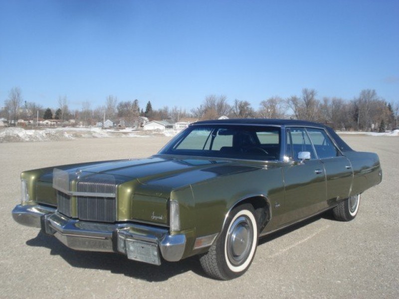 |
| Fiat 128 | 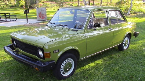 |
| Honda Civic | 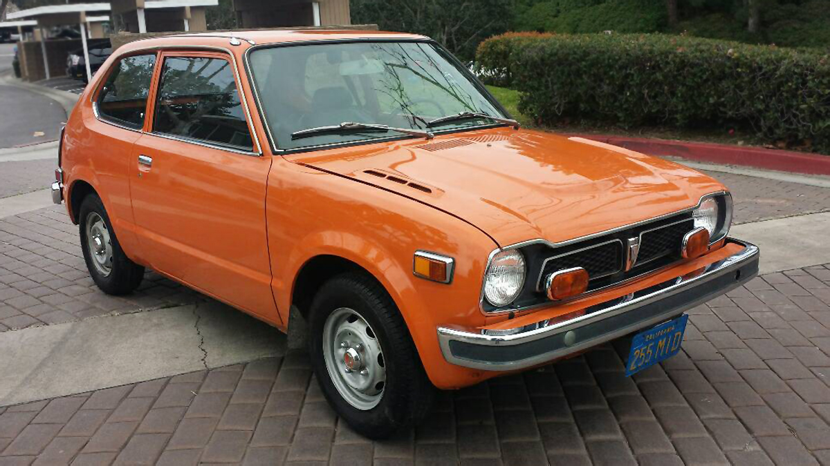 |
| Toyota Corolla | 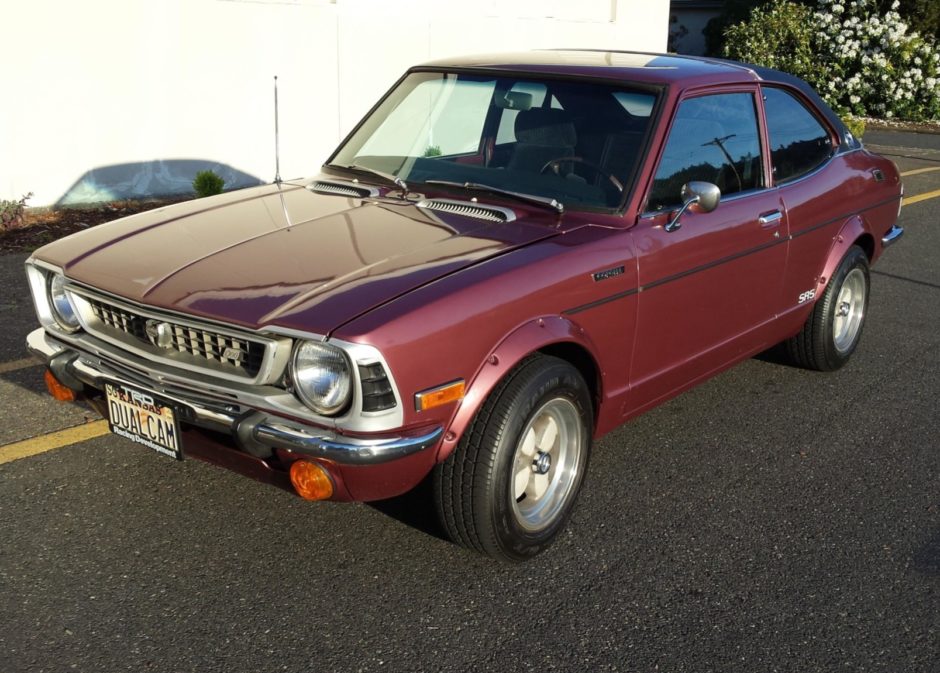 |
| Toyota Corona | 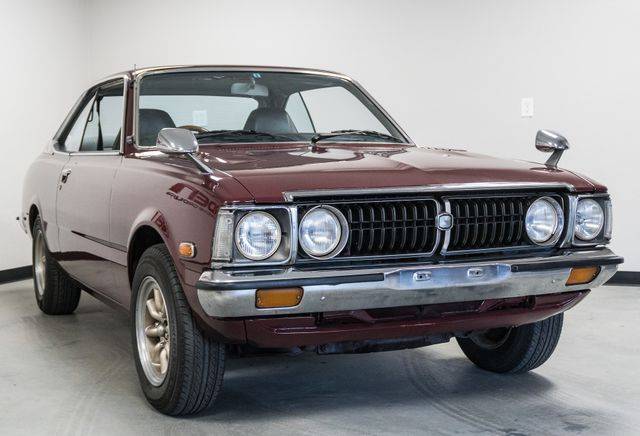 |
| Dodge Challenger | 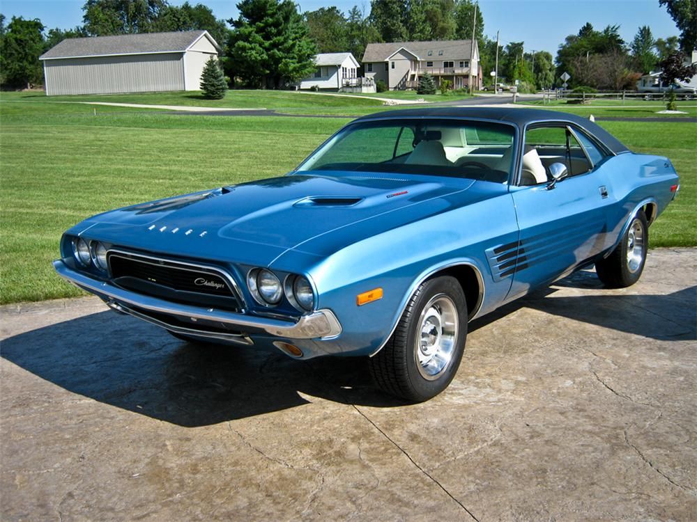 |
| AMC Javelin | 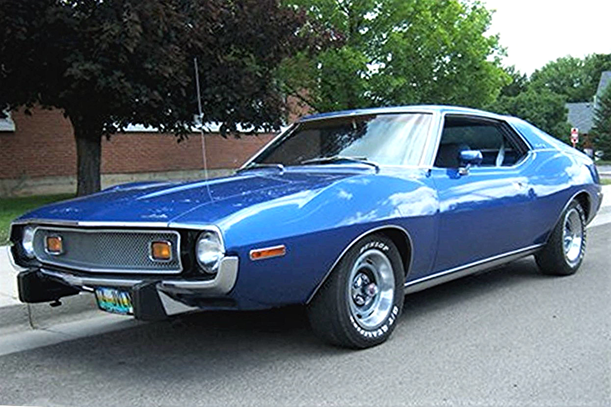 |
| Camaro Z28 | 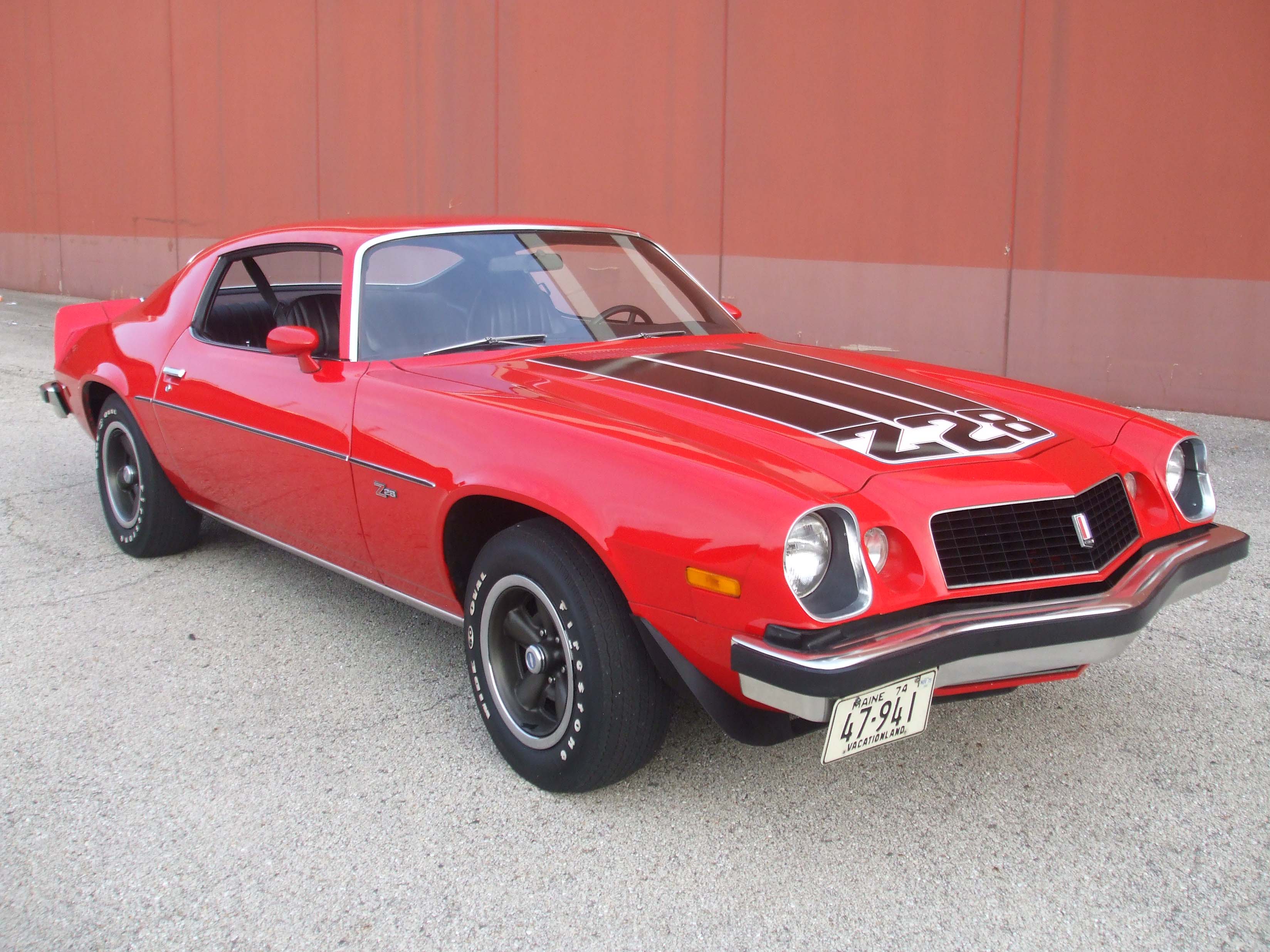 |
| Pontiac Firebird | 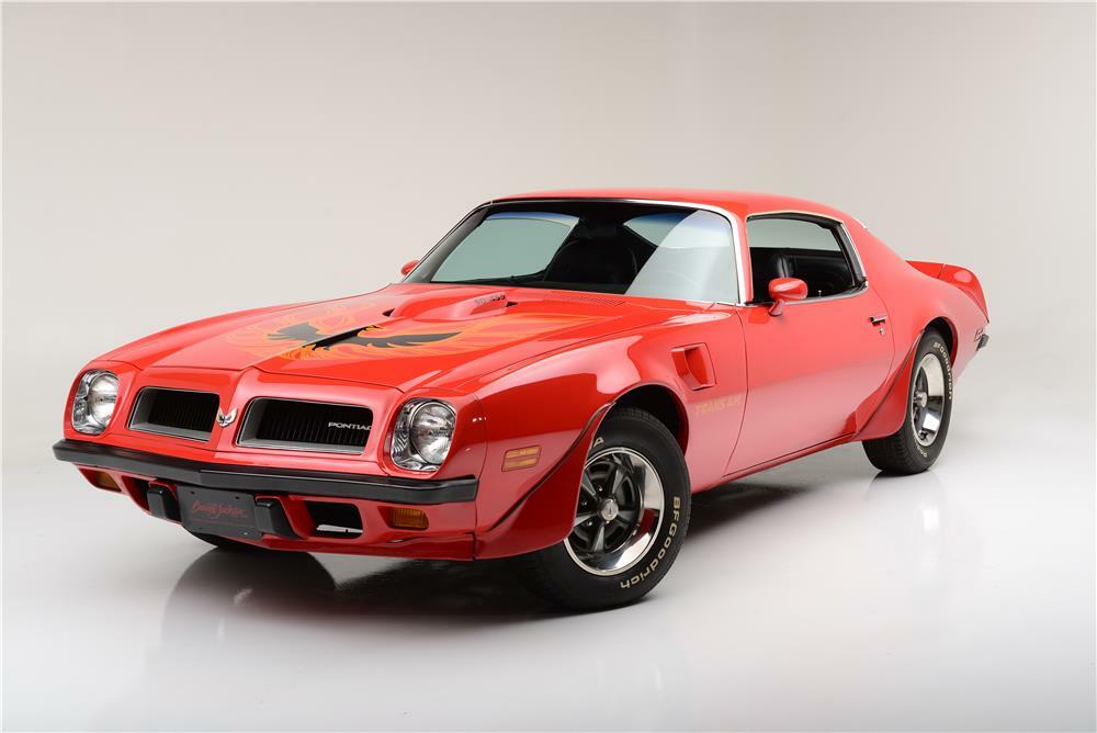 |
| Fiat X1-9 | 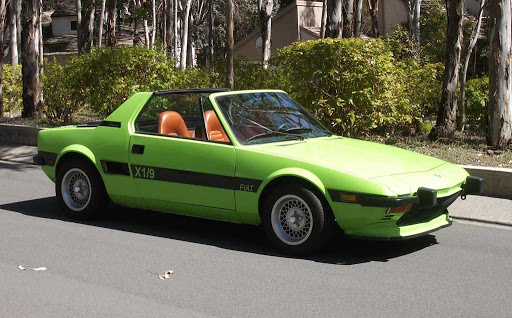 |
| Porsche 914-2 | 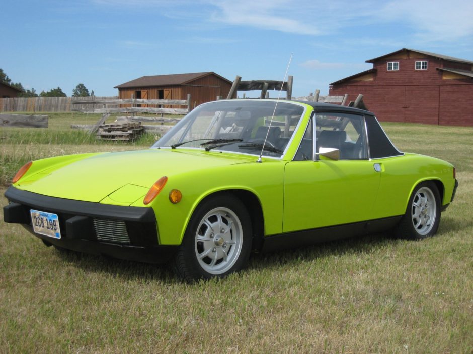 |
| Lotus Europa | 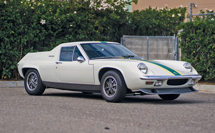 |
| Ford Pantera L | 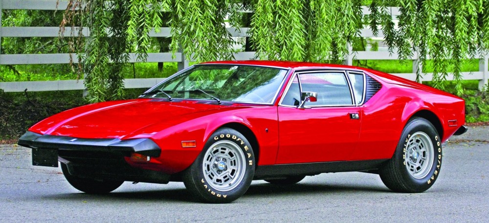 |
| Ferrari Dino | 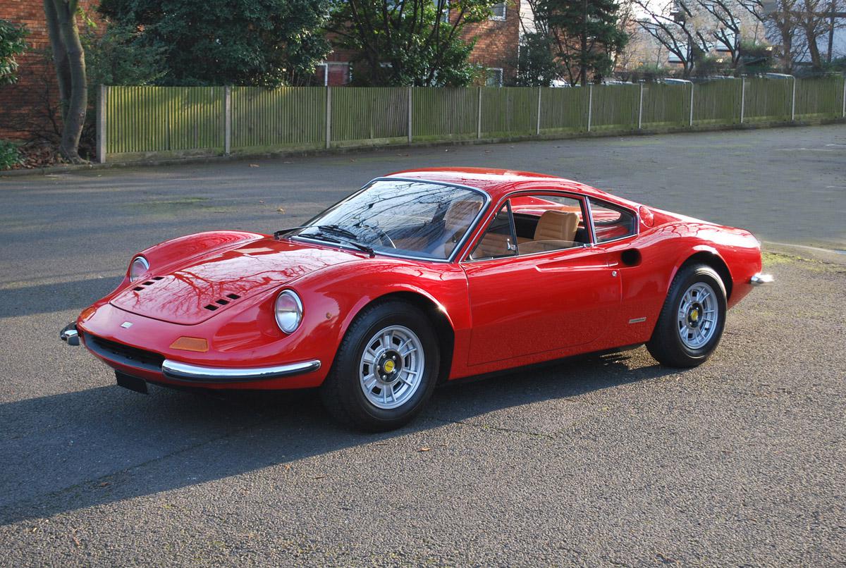 |
| Maserati Bora | 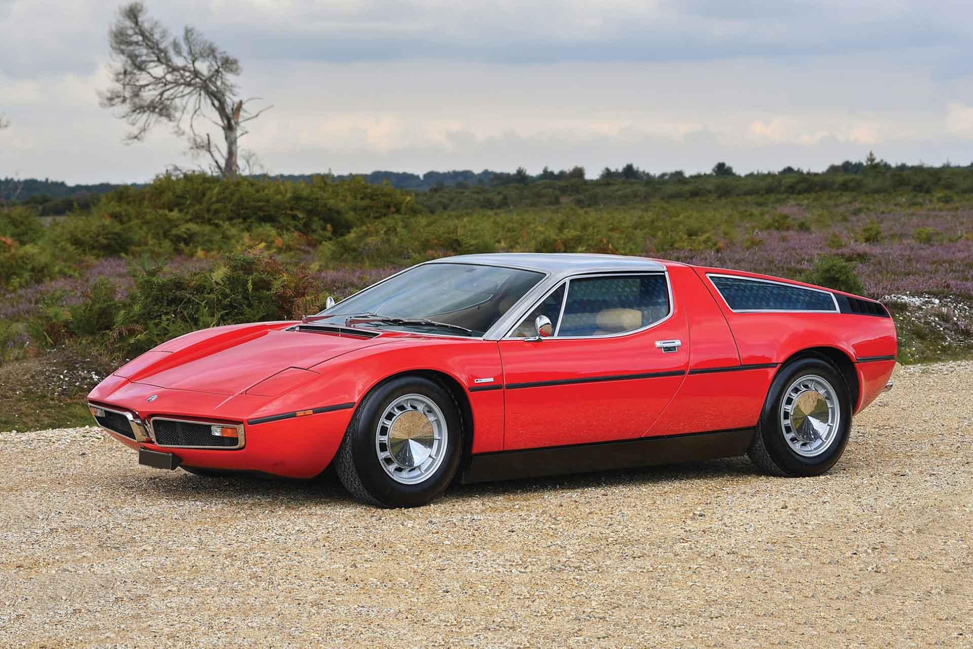 |
| Volvo 142E | 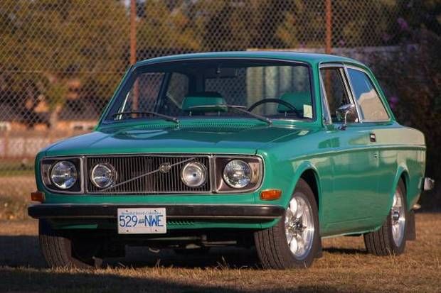 |
So that table looks like crap ’cos it’s being rendered through MDX and Gatsby etc., but if you run that code in RStudio, you’ll get something like this snapshot:
Nice! Try it out, some of these are beautiful cars.
We could make the images smaller and annotate them with the name of the car, which might make it possible to view the dataset and the car in the same tibble view.
imgs <- glue("images/{dir('images')}")
map(imgs, ~{
  fileout <- str_remove(.x, ".jpg")
  anno <- str_remove(fileout, "images/")
  image_read(.x) %>%
    image_resize("125x125") %>%
    image_border(color = "white", geometry = "0x20") %>%
    image_annotate(text = anno, size = 14, gravity = "southwest", color = "black") %>%
    image_write(path = glue("{fileout}-annotated.jpg"))
  }
)
mtcars %>%
rownames_to_column("model") %>%
mutate(imgnames = glue("images/{str_remove_all(model, ' ')}-annotated.jpg")) %>%
rowwise() %>%
mutate(car = pandoc.image.return(imgnames)) %>%
select(car, everything(), -c(model, imgnames)) %>%
pander(justify = rep("left", 12), split.cells = rep(1, 12),
split.table = Inf)That looks like this screenshot:
Not bad. Ok, let’s see if we can include them in a plot, thanks to Claus Wilke’s ggtext package:
library(ggtext)

imgs_tiny <- glue("images/{dir('images', pattern = 'annotated')}")

map(imgs_tiny, ~{
  fileout <- str_remove(.x, "-annotated.jpg")
  image_read(.x) %>%
    image_resize("70x70") %>%
    image_write(path = glue("{fileout}-tiny.jpg"))
  }
)
mt2 <- mtcars %>%
  rownames_to_column("model") %>%
  mutate(
    images = glue("images/{str_remove_all(model, ' ')}-tiny.jpg"),
    images = glue("<img src='{images}'/>")
    )

labels0 <- mt2 %>%
  arrange(mpg) %>%
  filter(am == 0) %>%
  pull(images)
labels1 <- mt2 %>%
  arrange(mpg) %>%
  filter(am == 1) %>%
  pull(images)
am0 <- ggplot(mt2 %>% filter(am == 0),
aes(x = fct_reorder(model, mpg),
y = mpg, fill = mpg)) +
geom_col() +
scale_x_discrete(
name = NULL,
labels = labels0
) +
scale_fill_viridis_c(option = "plasma") +
theme_minimal() +
labs(y = "Miles per Gallon", title = "Automatic Transmission") +
theme(
axis.text.x = element_markdown(color = "black", size = .75),
legend.position = "none"
)
am1 <- ggplot(mt2 %>% filter(am == 1),
aes(x = fct_reorder(model, mpg),
y = mpg, fill = mpg)) +
geom_col() +
scale_x_discrete(
name = NULL,
labels = labels1
) +
theme_minimal() +
scale_fill_viridis_c(option = "plasma") +
labs(y = "Miles per Gallon", title = "Maunual Transmission") +
theme(
axis.text.x = element_markdown(color = "black", size = .7),
legend.position = "none"
)am0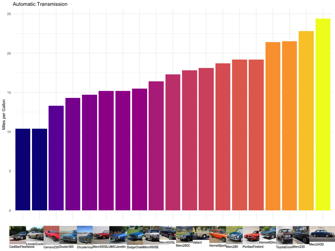
am1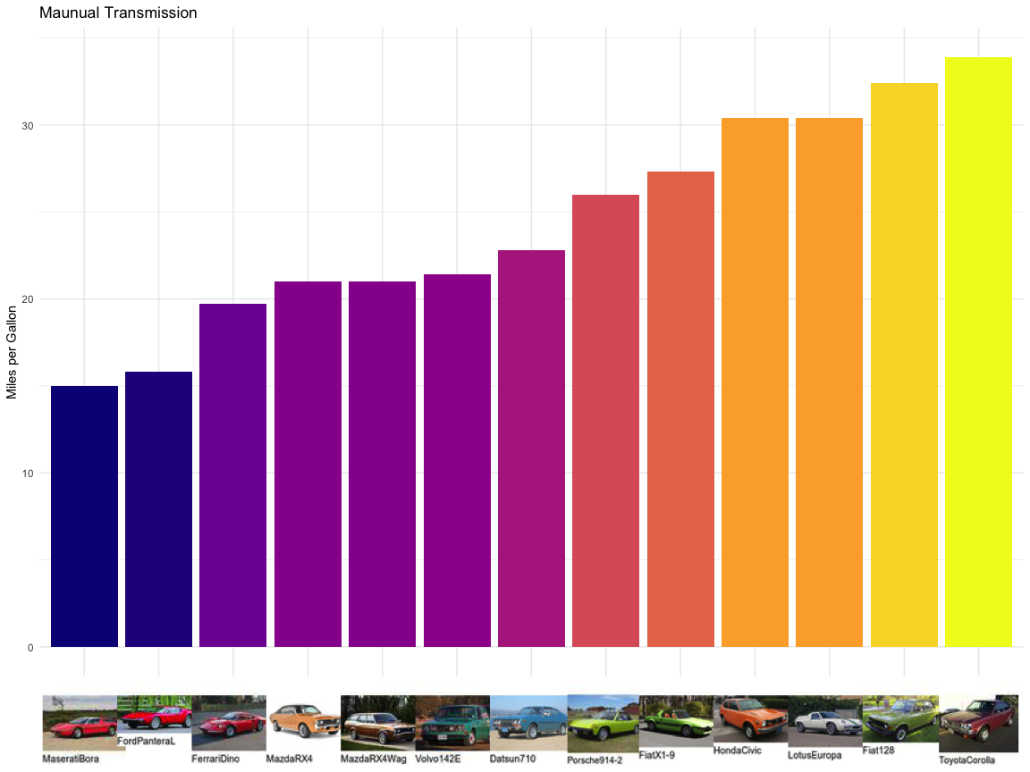
Well they’re quite hideous 🙄. Maybe if we plot less of them on each graph, we might get something a bit nicer. We can group the cars by where they were made – roughly Germany, Asia, the US and Europe without Germany.
europe <- c("De Tomaso", "Maserati", "Volvo", "Pantera", "Fiat",
            "Lotus", "Ferrari", "Porsche")
asia <- c("Datsun", "Toyota", "Honda", "Mazda")

mt3 <- mtcars %>%
  rownames_to_column("model") %>%
  mutate(
    images = glue("images/{str_remove_all(model, ' ')}-annotated.jpg"),
    images = glue("<img src='{images}'/>"),
    carmaker = str_extract(model, "[a-zA-Z]* ") %>% str_trim(),
    carmaker = case_when(
      carmaker == "Hornet" ~ "AMC",
      is.na(carmaker) ~ "Plymouth", # Valiant
      carmaker == "Duster" ~ "Plymouth",
      carmaker == "Camaro" ~ "Chevrolet",
      carmaker == "Ford" ~ "De Tomaso",
      TRUE ~ carmaker
    ),
    region = case_when(
    carmaker %in% europe ~ "Europe",
    carmaker %in% asia ~ "Asia",
    carmaker == "Merc" ~ "Germany",
    TRUE ~ "US"
  ))
labs_eu <- mt3 %>%
filter(region == "Europe") %>%
arrange(mpg) %>%
pull(images)
eu <- ggplot(mt3 %>% filter(region == "Europe"),
aes(x = fct_reorder(model, mpg),
y = mpg)) +
geom_col(fill = "#d02a1e", colour = "#911d15") +
scale_x_discrete(
name = NULL,
labels = labs_eu
) +
theme_minimal() +
labs(y = "Miles per Gallon", title = "European Cars") +
theme(
axis.text.x = element_markdown(color = "black", size = .35),
legend.position = "none"
)
labs_asia <- mt3 %>%
filter(region == "Asia") %>%
arrange(mpg) %>%
pull(images)
asia <- ggplot(mt3 %>% filter(region == "Asia"),
aes(x = fct_reorder(model, mpg),
y = mpg)) +
geom_col(fill = "#daa471", colour = "#b7712f") +
scale_x_discrete(
name = NULL,
labels = labs_asia
) +
theme_minimal() +
labs(y = "Miles per Gallon", title = "Asian Cars") +
theme(
axis.text.x = element_markdown(color = "black", size = .7),
legend.position = "none"
)
labs_us <- mt3 %>%
filter(region == "US") %>%
arrange(mpg) %>%
pull(images)
us <- ggplot(mt3 %>% filter(region == "US"),
aes(x = fct_reorder(model, mpg),
y = mpg)) +
geom_col(fill = "#e8682c", colour = "#ae4412") +
scale_x_discrete(
name = NULL,
labels = labs_us
) +
theme_minimal() +
labs(y = "Miles per Gallon", title = "American Cars") +
theme(
axis.text.x = element_markdown(color = "black", size = .35),
legend.position = "none"
)
labs_ger <- mt3 %>%
filter(region == "Germany") %>%
arrange(mpg) %>%
pull(images)
ger <- ggplot(mt3 %>% filter(region == "Germany"),
aes(x = fct_reorder(model, mpg),
y = mpg)) +
geom_col(fill = "#314f6d", colour = "#22374c") +
scale_x_discrete(
name = NULL,
labels = labs_ger
) +
theme_minimal() +
labs(y = "Miles per Gallon", title = "German Cars") +
theme(
axis.text.x = element_markdown(color = "black", size = .35),
legend.position = "none"
)eu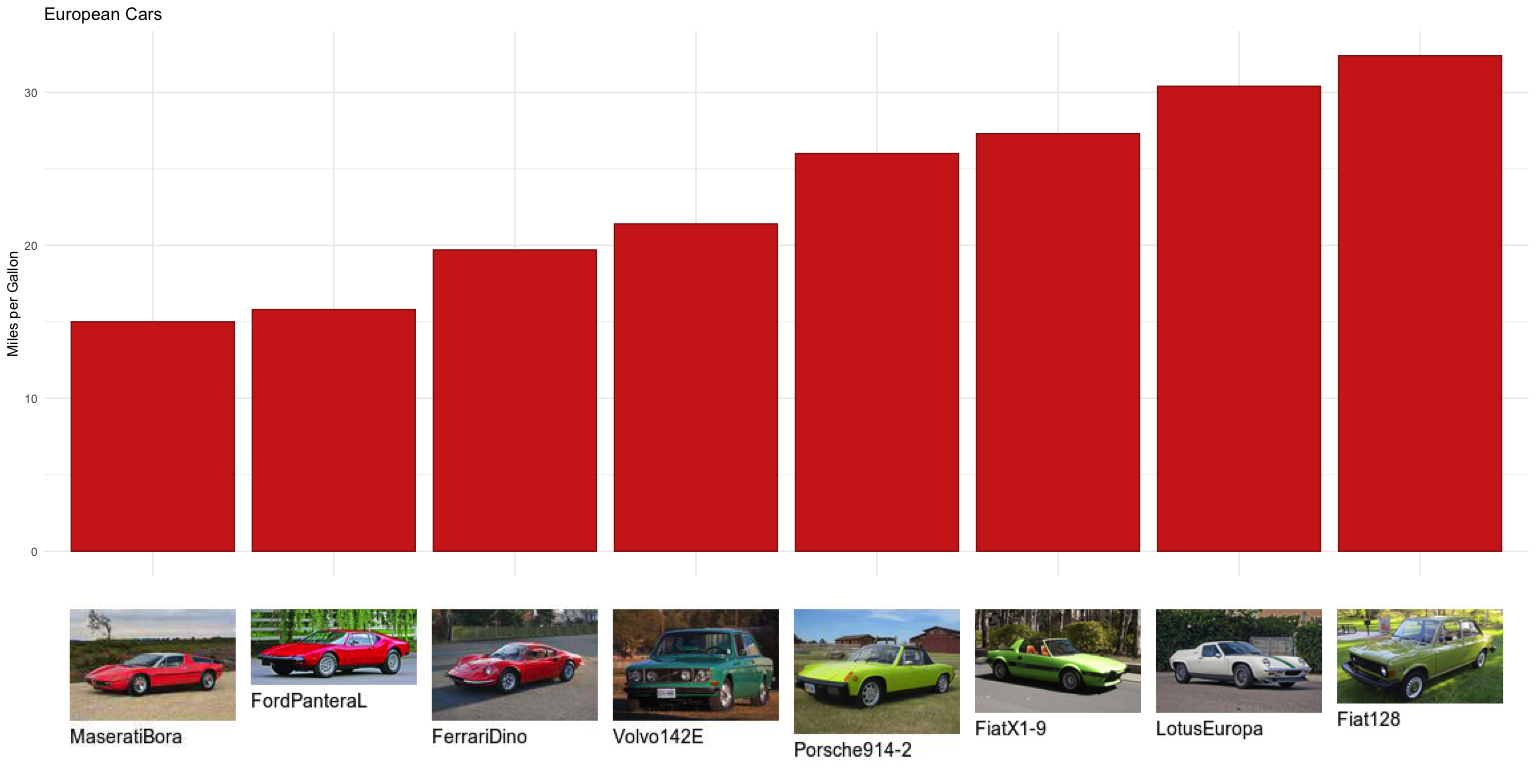
asia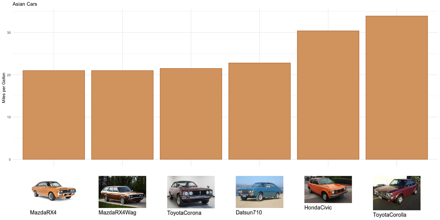
us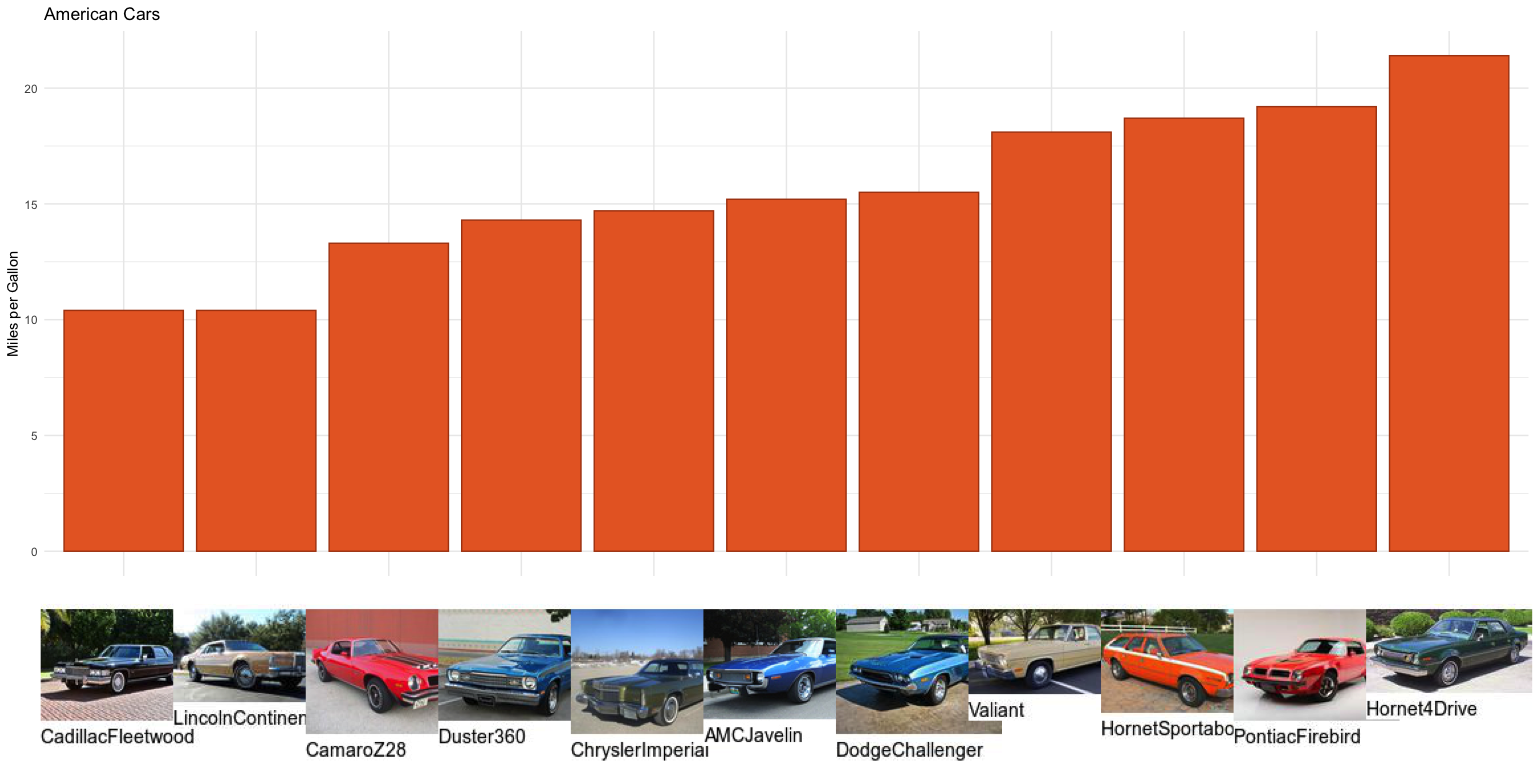
ger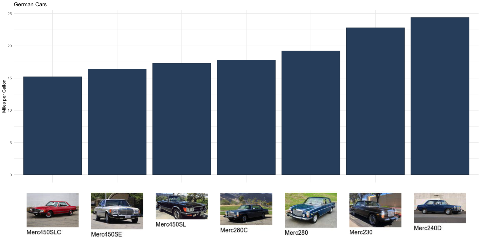
They’re not so bad, at least the ones with fewer bars.
Recently, Mikefc/coolbutuseless tweeted about a cool new package of his called ggpattern. There’s an example here of flags inside bars, let’s see if we can get cars in bars.
library(ggpattern)
mt4 <- mt3 %>%
  mutate(images = strex::str_after_first(images, "'") %>%
           strex::str_before_first("-annotated"),
         images = glue("{images}.jpg"))

ggplot(mt4 %>% filter(region == "Germany"),
       aes(x = fct_reorder(model, mpg), y = mpg)) +
  geom_bar_pattern(stat = "identity",
    aes(
      pattern_filename = fct_reorder(model, mpg)
    ),
    pattern         = 'image',
    pattern_type    = 'none',
    fill            = 'grey80',
    colour          = 'grey66',
    pattern_scale   = -1,
    pattern_filter  = 'point',
    pattern_gravity = 'east'
  ) +
  theme_minimal() + labs(x = NULL, y = "Miles per Gallon") +
  theme(legend.position = 'none') +
  scale_pattern_filename_discrete(choices = mt4 %>%
                                     filter(region == "Germany") %>%
                                     arrange(mpg) %>%
                                     pull(images)) +
  coord_flip()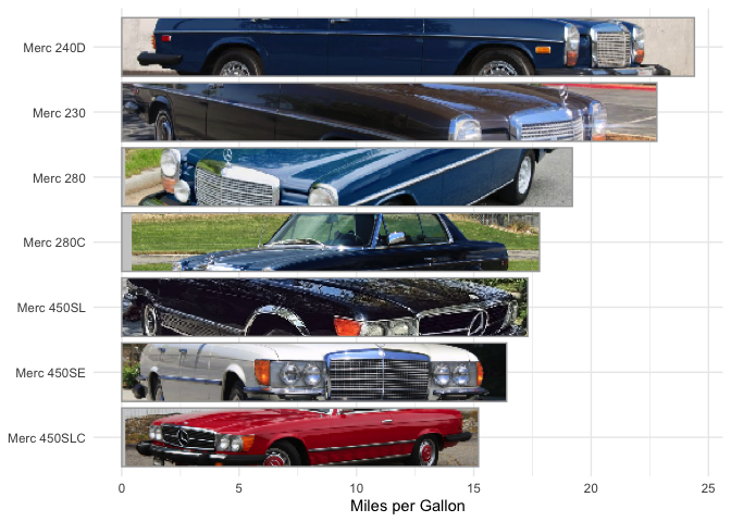
ggplot(mt4 %>% filter(region == "US"),
       aes(x = fct_reorder(model, mpg), y = mpg)) +
  geom_bar_pattern(stat = "identity",
    aes(
      pattern_filename = fct_reorder(model, mpg)
    ),
    pattern         = 'image',
    pattern_type    = 'none',
    fill            = 'grey80',
    colour          = 'grey66',
    pattern_scale   = -1,
    pattern_filter  = 'point',
    pattern_gravity = 'east'
  ) +
  theme_minimal() + labs(x = NULL, y = "Miles per Gallon") +
  theme(legend.position = 'none') +
  scale_pattern_filename_discrete(choices = mt4 %>%
                                    filter(region == "US") %>%
                                    arrange(mpg) %>%
                                    pull(images)) +
  coord_flip()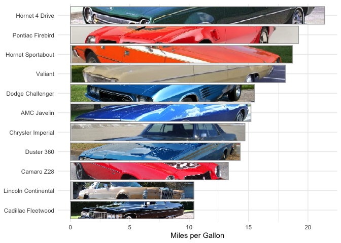
ggplot(mt4 %>% filter(region == "Europe"),
       aes(x = fct_reorder(model, mpg), y = mpg)) +
  geom_bar_pattern(stat = "identity",
    aes(
      pattern_filename = fct_reorder(model, mpg)
    ),
    pattern         = 'image',
    pattern_type    = 'none',
    fill            = 'grey80',
    colour          = 'grey66',
    pattern_scale   = -1,
    pattern_filter  = 'point',
    pattern_gravity = 'east'
  ) +
  theme_minimal() + labs(x = NULL, y = "Miles per Gallon") +
  theme(legend.position = 'none') +
  scale_pattern_filename_discrete(choices = mt4 %>%
                                    filter(region == "Europe") %>%
                                    arrange(mpg) %>%
                                    pull(images)) +
  coord_flip()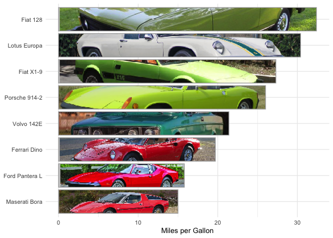
ggplot(mt4 %>% filter(region == "Asia"),
       aes(x = fct_reorder(model, mpg), y = mpg)) +
  geom_bar_pattern(stat = "identity",
    aes(
      pattern_filename = fct_reorder(model, mpg)
    ),
    pattern         = 'image',
    pattern_type    = 'none',
    fill            = 'grey80',
    colour          = 'grey66',
    pattern_scale   = -1,
    pattern_filter  = 'point',
    pattern_gravity = 'east'
  ) +
  theme_minimal() + labs(x = NULL, y = "Miles per Gallon") +
  theme(legend.position = 'none') +
  scale_pattern_filename_discrete(choices = mt4 %>%
                                    filter(region == "Asia") %>%
                                    arrange(mpg) %>%
                                    pull(images)) +
  coord_flip()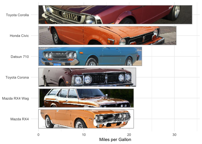
Not so bad, again with the ones with fewer bars.
In Mike’s example, he puts the flags at the end of the bars. let’s do that:
ggplot(mt4 %>% filter(region == "Asia"),
       aes(x = fct_reorder(model, mpg), y = mpg)) +
  geom_bar_pattern(stat = "identity",
    aes(
      pattern_filename = fct_reorder(model, mpg)
    ),
    pattern         = 'image',
    pattern_type    = 'none',
    fill            = 'grey80',
    colour          = 'grey66',
    pattern_scale   = -2,
    pattern_filter  = 'point',
    pattern_gravity = 'east'
  ) +
  theme_minimal() + labs(x = NULL, y = "Miles per Gallon") +
  theme(legend.position = 'none') +
  scale_pattern_filename_discrete(choices = mt4 %>%
                                    filter(region == "Asia") %>%
                                    arrange(mpg) %>%
                                    pull(images)) +
  coord_flip()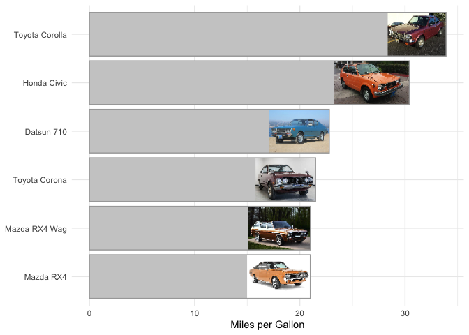
Image deteriorates in quality but prob a better plot overall. We could also use the images as geoms themselves with the ggimage package:
library(ggimage)
ggplot(mt4, aes(x = wt, y = mpg)) +
  geom_image(aes(image = images), size = 0.1) +
  geom_label(aes(label = model), size = 2.5, nudge_y = -0.75) +
  theme_minimal()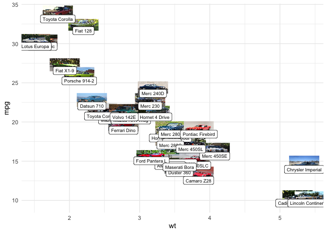
…or maybe not.
Like I said above, some of these cars are gorgeous, could be nice to see them in a little Shiny app or something.
Update: Turns out Mara Averick, @dataandme on Twitter, posted pics of these cars back in 2018! Many are even the same photos. Nice to see I’m not the only one who wondered what they look like!