How wet was winter 2023/2024?

Published

May 4, 2024

I’m back! It’s been years since I blogged on here. There are many reasons for that, being busy is a big one, kid, job etc.Getting a new laptop recently has renewed my interest in blogging again. I’ve decided to change from gatsby.js to quarto for a simplified workflow. As much as I liked learning Javascript, keeping up with the changes in dependencies and the security vulnerabilities is too much of a commitment for something that’s supposed to be light-hearted and fun.

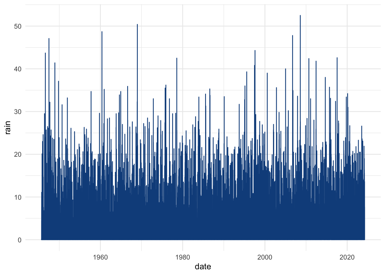
So let’s start off with a question that many in Ireland might have been asking themselves over the past few months – just how wet was that freaking winter?? It certainly seemed worse than usual, but let’s see if we can find any data to help us figure that out. I’m getting this from Met Eireann, and it’s for the Shannon Airport weather station. Shannon, being on the West, can be quite a bit wetter than other parts of the country like Dublin or Waterford, so if 2024 was wet, I’d say we could probably expect it to be magnified here. Maybe not, I’ll defer to meteorologists on that one.

library(readr)
library(dplyr)
library(stringr)
library(lubridate)
library(ggplot2)
library(tidyr)
library(glue)

rain <- read_csv("https://cli.fusio.net/cli/climate_data/webdata/dly518.csv", skip = 24) |> 
  select(date, rain)

knitr::kable(head(rain))
date rain
01-sep-1945 0.2
02-sep-1945 0.0
03-sep-1945 0.0
04-sep-1945 0.0
05-sep-1945 0.0
06-sep-1945 0.0

So we’ve got a little lit of work to do on those dates. We’ve got three-letter abbreviations for each month:

rain |> 
  mutate(
    months = str_extract(date, "-[a-z]*-") |> str_remove_all("-")
  ) |> 
  distinct(months) |> 
  knitr::kable()
months
sep
oct
nov
dec
jan
feb
mar
apr
may
jun
jul
aug

I’m sure there’s a better way to do this, but since we’ve only got 12 to change, let’s just do it this way.

rain |> 
  mutate(
    date = str_replace(date, "jan", "01"),
    date = str_replace(date, "feb", "02"),
    date = str_replace(date, "mar", "03"),
    date = str_replace(date, "apr", "04"),
    date = str_replace(date, "may", "05"),
    date = str_replace(date, "jun", "06"),
    date = str_replace(date, "jul", "07"),
    date = str_replace(date, "aug", "08"),
    date = str_replace(date, "sep", "09"),
    date = str_replace(date, "oct", "10"),
    date = str_replace(date, "nov", "11"),
    date = str_replace(date, "dec", "12"),
    date = parse_date_time(date, "dmy")
    ) -> rain

Let’s have a quick look at this dataset. We’ll make things feel rainy with new blue defaults for geoms:

blue <- "dodgerblue4"
theme_set(theme_minimal())
update_geom_defaults("point", list(colour = blue))
update_geom_defaults("bar", list(colour = blue, fill = "dodgerblue2"))
update_geom_defaults("line", list(colour = blue))

ggplot(rain, aes(x = date, y = rain)) +
  geom_line()

That’s a long time series! Maybe let’s simplify things. We’ll group by month and sum, that might give us something that’s easier to think about.

month_rain <- rain |> 
  mutate(m_date = floor_date(date, "month")) |> 
  group_by(m_date) |> 
  summarise(month_sum = sum(rain)) |> 
  ungroup()

ggplot(month_rain, aes(x = m_date, y = month_sum)) +
  geom_line()

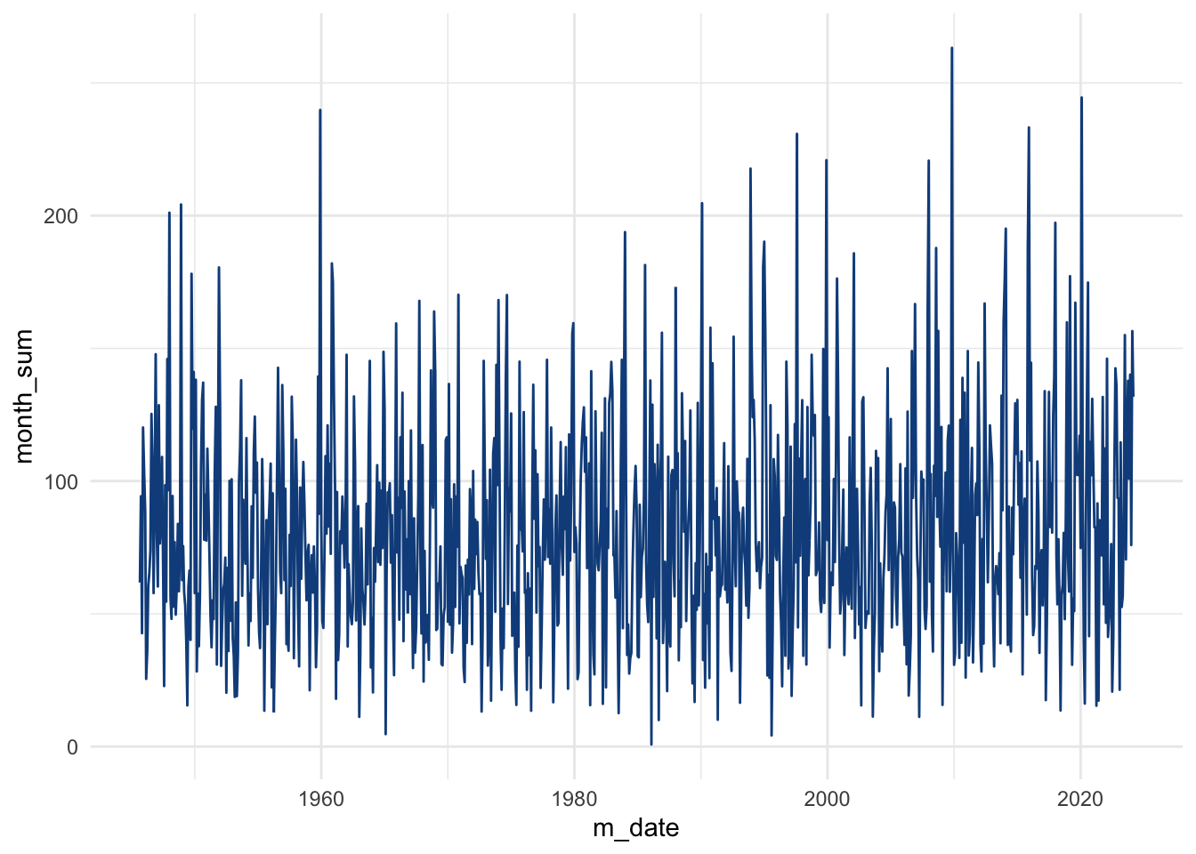
Ok, now we can start to see the cycle throughout the years, along with a few spikes for particularly dry or wet months. It’s a little hard to see the winter months here as everything is bunched up so we can split winter and non-winter apart. I’m including October to March in winter here, if we followed the Romans (“Hibernia”), we’d probably just use the whole year as winter!

month_rain <- month_rain |> 
  mutate(
    winter = if_else(month(m_date) %in% c(10, 11, 12, 1, 2), TRUE, FALSE)
    )

ggplot(month_rain, aes(x = m_date, y = month_sum)) +
  geom_line() +
  facet_grid(~winter) +
  geom_smooth()

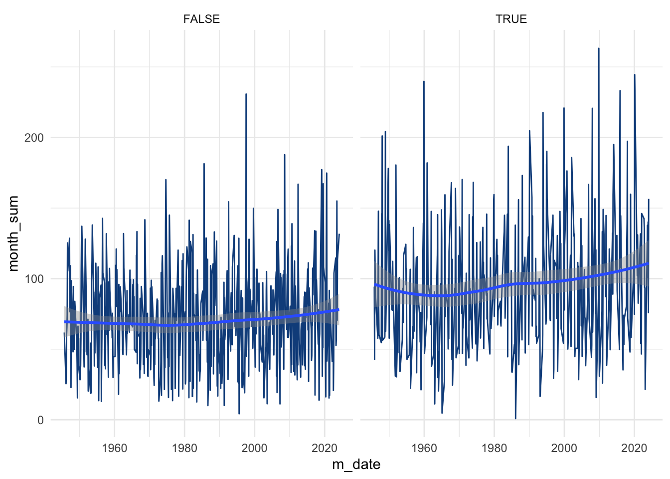
Alright, so now we can clearly see that winter, as you would expect, has an elevated level of rainfall, along with more spikes of high rainfall. Interestingly, there are plenty of dry spikes too, particularly in the early 1960s. Maybe 2024 just feels wetter in comparison to the last few years? Let’s shorten the timespan:

month_rain |> 
  filter(year(m_date) > 2018, winter) |> 
  ggplot(aes(x = m_date, y = month_sum)) +
  geom_col()

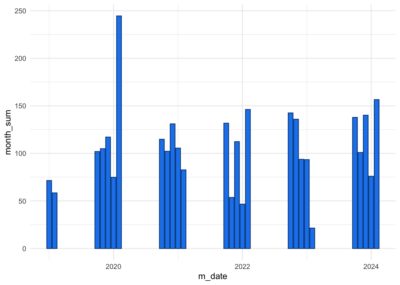
2023/4 was a bit more consistently wet but as we can see, it’s nothing particularly unusual. It’s odd, I remember 2020 as a dry winter and a great spring, excepting the obvious, of course.

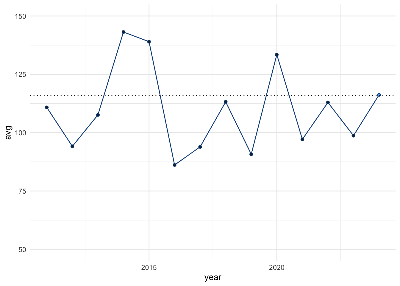
If we look back a little longer, to 2010, and highlight 2024, we can see that, nope, 2023/4 just wasn’t that bad, although most years were drier. Compared to other years in Ireland, of course, not comparing to non-Hibernia.

month_rain |> 
  filter(year(m_date) > 2010, winter) |> 
  group_by(year = year(m_date)) |> 
  summarise(avg = mean(month_sum)) |> 
  mutate(twentyfour = ifelse(year == 2024, 1, 0)) |> 
  ggplot(aes(x = year, y = avg, fill = twentyfour)) +
  geom_line() +
  geom_point(shape = 21) +
  ylim(c(50, 150)) +
  guides(fill = "none") +
  geom_hline(yintercept = 116, linetype = 3)

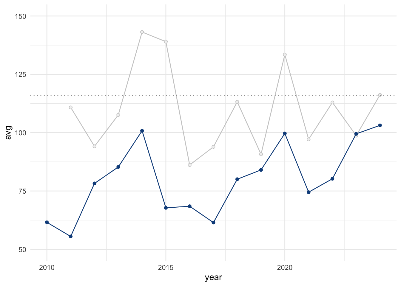
“Non-Hibernia” - that’s interesting, actually. I wonder how the West of Ireland compares to England, let’s say. The Met Office has some great stats (going back to 1836!!), let’s grab them for the South of England (likely to be much drier). This file is a bit challenging to read in, but we can fix that. Let’s filter for the same time period (2010 onwards) too. I love how these weather guys like their three-letter month names, jeez.

eng_rain <- read_table(
  "https://www.metoffice.gov.uk/pub/data/weather/uk/climate/datasets/Rainfall/date/England_S.txt",
  skip = 6,
  col_names = c(
    "year", "jan", "feb", "mar", "apr", "may", "jun", "jul", "aug", "sep",
    "oct", "nov", "dec", "win", "spr", "sum", "aut", "ann"
    )
  ) |> 
  select(year:mar, oct:dec) |> 
  filter(year >= 2010) |> 
  pivot_longer(jan:dec) |> 
  mutate(
    month = case_when(
      name == "jan" ~ "01",
      name == "feb" ~ "02",
      name == "mar" ~ "03",
      name == "oct" ~ "10",
      name == "nov" ~ "11",
      name == "dec" ~ "12"
    ),
    date = glue("{year}-{month}-01") |> parse_date_time("ymd")
  ) |> 
  select(date, value)

Ok, let’s see if we can get fancy here – we’ll layer the Irish data behind the English data so we can compare them. I’ll use grey for the Irish data and we’ll keep the same plot limits and guiding line for 2024 in Shannon:

ire <- month_rain |> 
  filter(year(m_date) > 2010, winter) |> 
  group_by(year = year(m_date)) |> 
  summarise(avg = mean(month_sum))

eng <- eng_rain  |> 
  group_by(year = year(date)) |> 
  summarise(avg = mean(value, na.rm = TRUE))

ggplot(data = eng, aes(x = year, y = avg)) +
  geom_line(data = ire, colour = "grey80") +
  geom_point(data = ire, colour = "grey80", fill = "grey95", shape = 21) +
  ylim(c(50, 150)) +
  guides(fill = "none") +
  geom_hline(yintercept = 116, linetype = 3, colour = "grey60") +
  geom_line() +
  geom_point()

The South of England is much drier, as you might expect. Interestingly, 2023/4 was a wet year in Southern England!